Good Move
Tremains
Tremains is one of those iconic New Zealand companies with a rich history and track record of success. But the identity was starting to show its age in the highly competitive real estate sector and the leadership team wanted to re-energise the brand with a clearer proposition and promise to its customers.
So they commissioned Sven&Friends to develop a new strategic framework and rejuvenated visual identity to better reflect the business they had become. The brief was for clarity, modern simplicity and a design system that could be applied quickly and efficiently across the county.
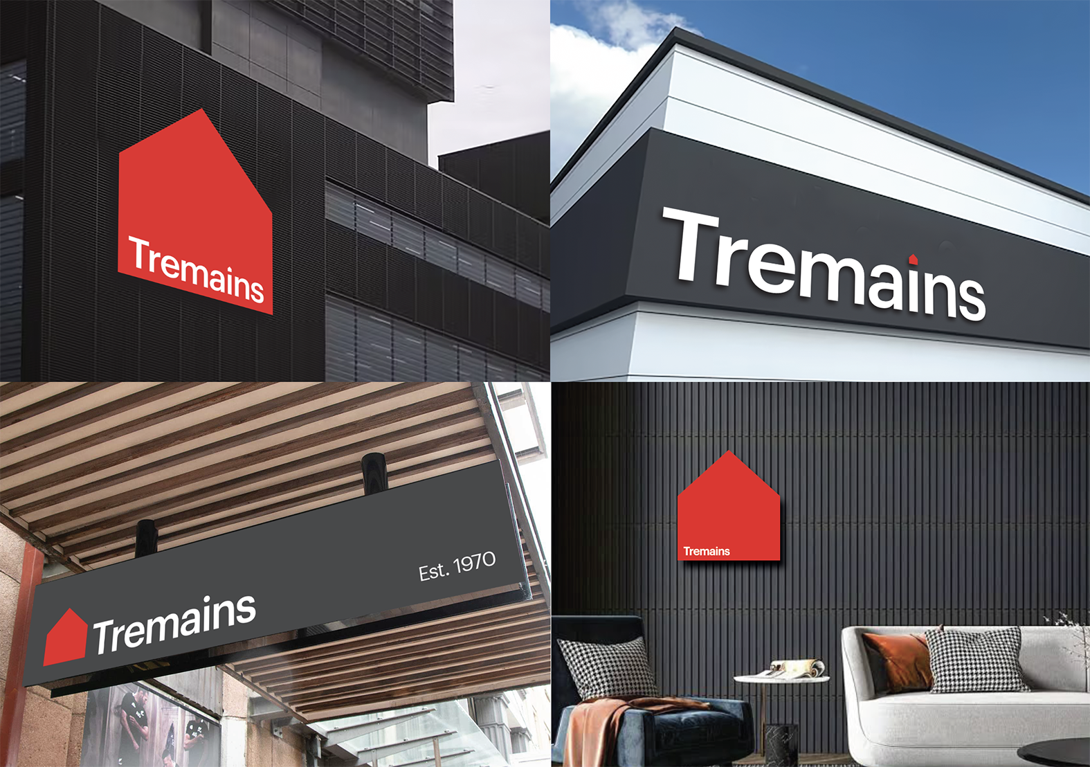
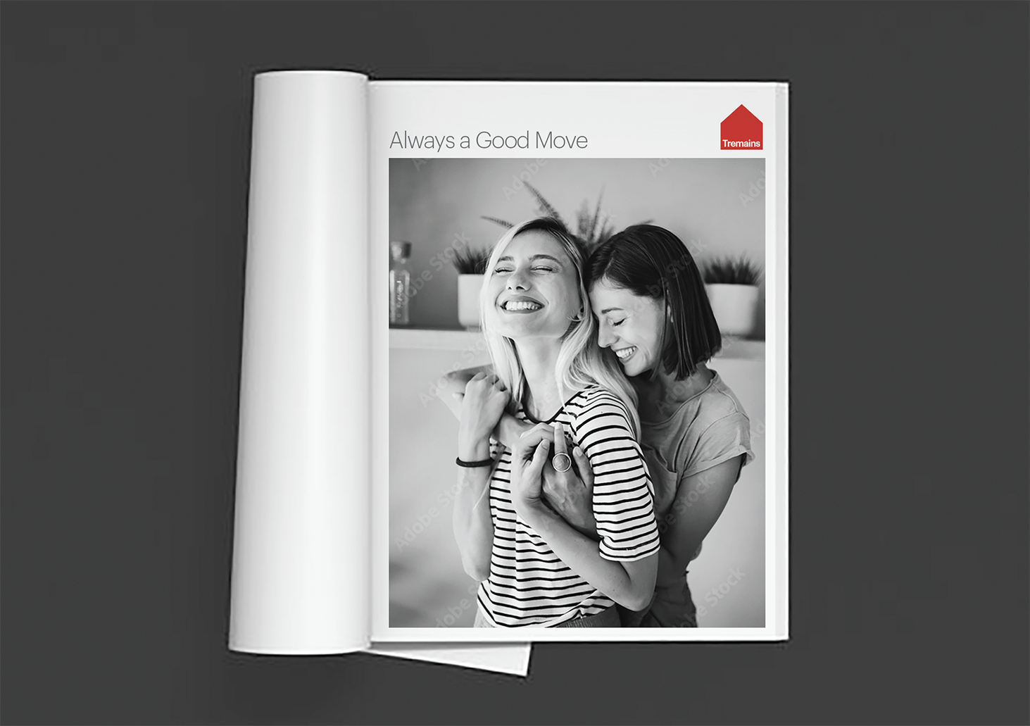
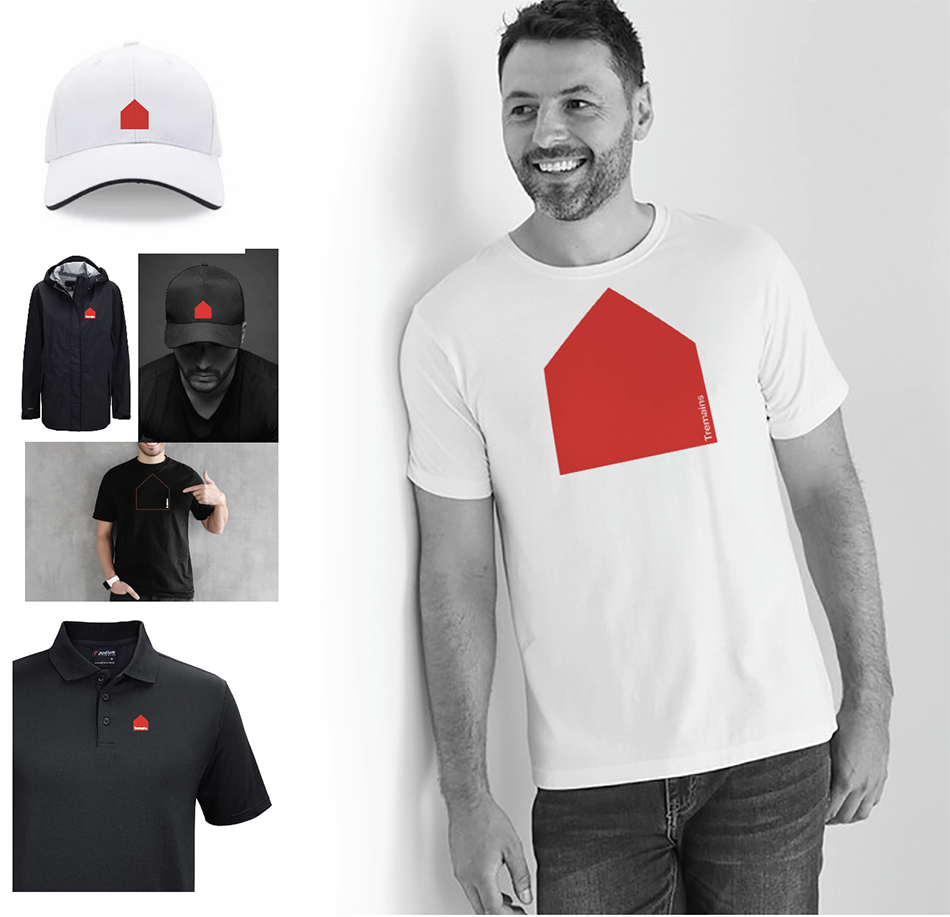
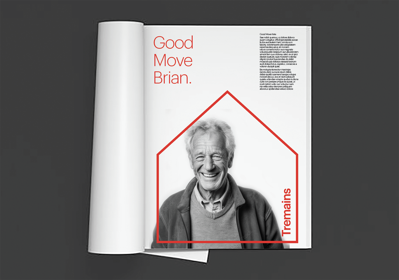
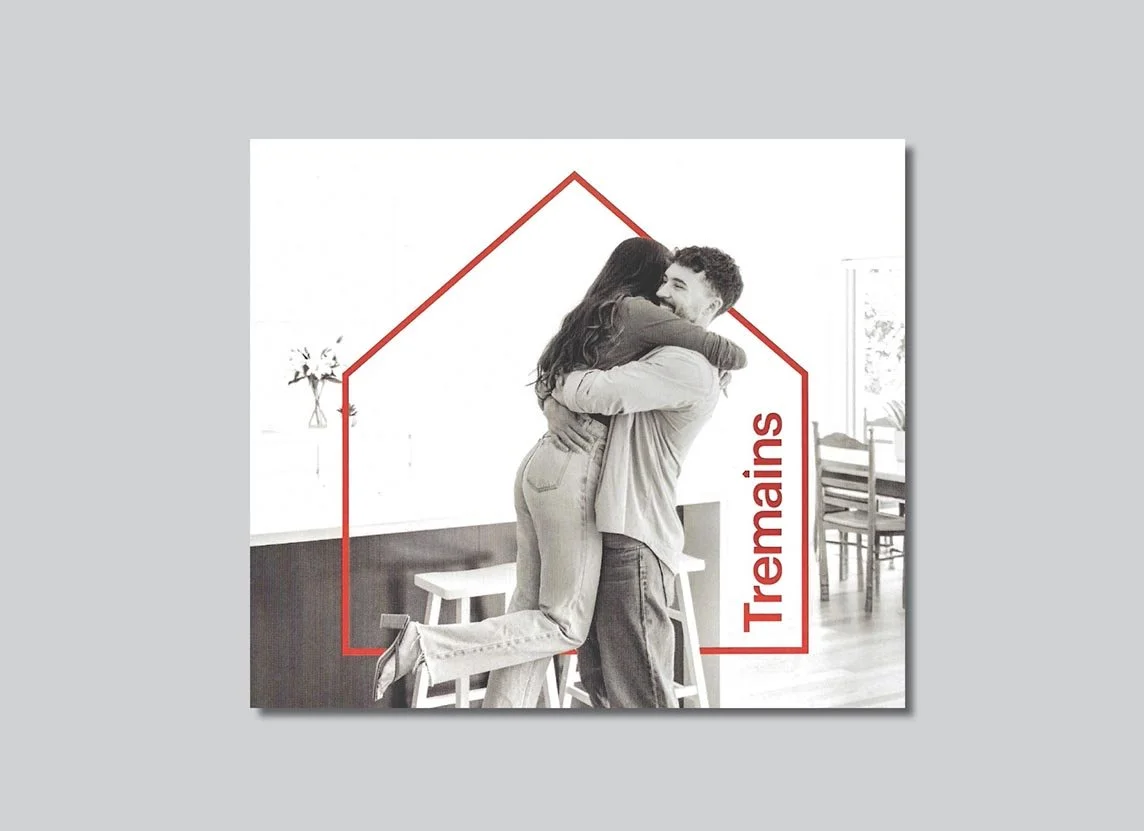
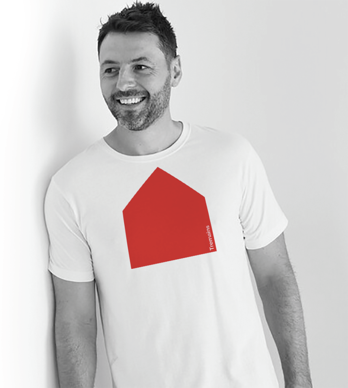
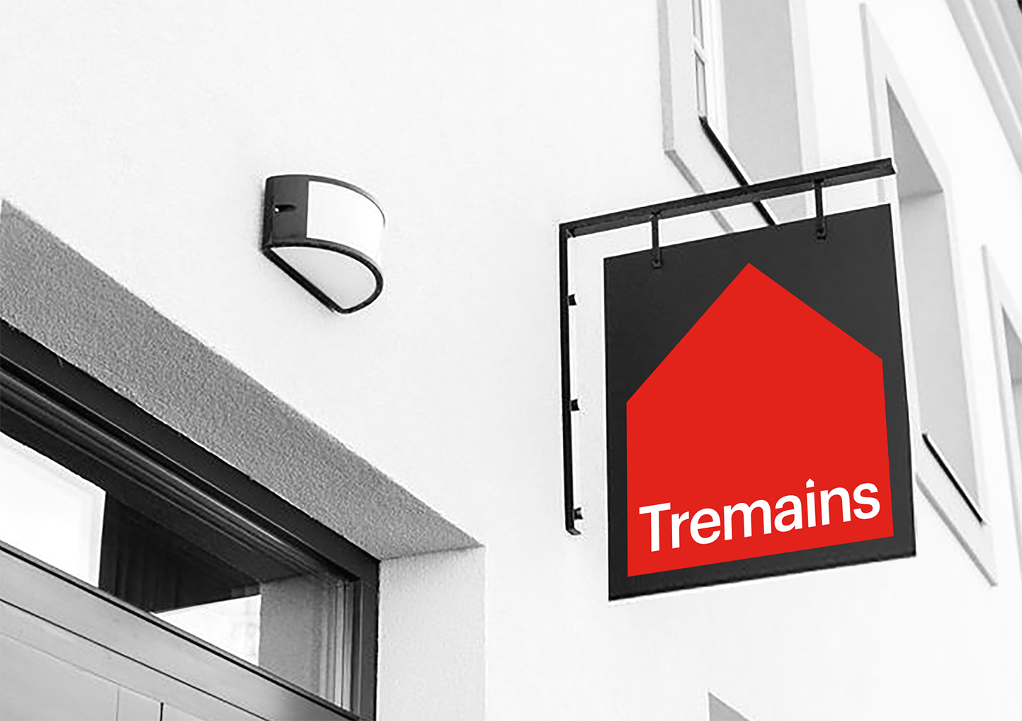
The solution is a deceptively simple symbol that is brought to life through a very dynamic and contemporary design system - bold, fresh, flexible, distinctive and very human.
The new identity is specifically designed to set Tremains apart from competitors in what has become a very crowded marketplace of real estate brands. Moving them into a more contemporary and aspirational space in line with the desired positioning. The volume of red can be turned up or down according to need, and the introduction of graphite gray and white space contribute to a more sophisticated look and feel.
This strategic shift is aimed at giving Tremains greater ‘brand stretch’ towards more premium segments, but without losing touch with the traditional ‘heartland New Zealand’ brand strength it enjoy today.